Impact
~2 hours
Estimated saving per reuse of a complex UI component
Developers previously rebuilt similar controls rather than reusing existing implementations. Shared components, specifications and implementation guidance replaced that repeated work with an agreed solution.
4 teams
Beginning wider adoption when I left.
Everyday reuse
Established in my immediate design and development team.
Illustrative workflow estimate: approximately four hours for repeated specification, styling, integration and review versus two hours when reusing an existing complex control. These are modelling assumptions, not measured Watlow delivery times. Initial library development and maintenance are excluded.
The scale of the work
- Developers in the R&D context
- ~50
- Teams beginning adoption
- 4
- Countries represented
- 4
UK · US · France · India. The system grew with my immediate team; these four teams describe the next stage of wider adoption when I left in June 2026. The developer count describes the R&D context.
The situation
When I started, there was no design system for the software. The development team had three people, and they kept building similar components again. That repeated effort also made the interface inconsistent. For a small engineering team, recreating controls took time away from building the product itself.
Watlow had global brand guidelines, but they did not define how the brand should work in a software interface. We needed shared visual foundations and components that designers and developers could actually use.
My responsibility
I created the software design foundations from scratch, starting in Sketch and later moving the work to Figma. I defined typography, colour and component rules within the global brand direction, then worked with frontend developers to turn those decisions into reusable interface patterns.
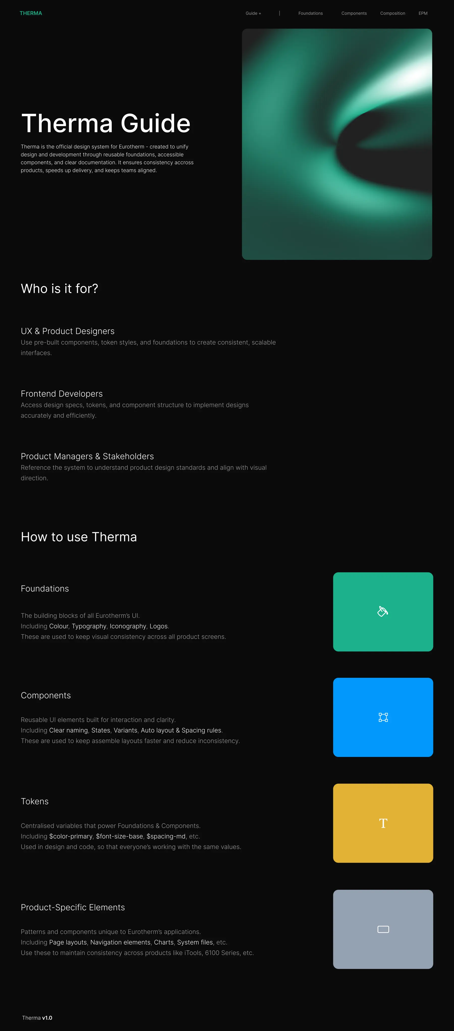
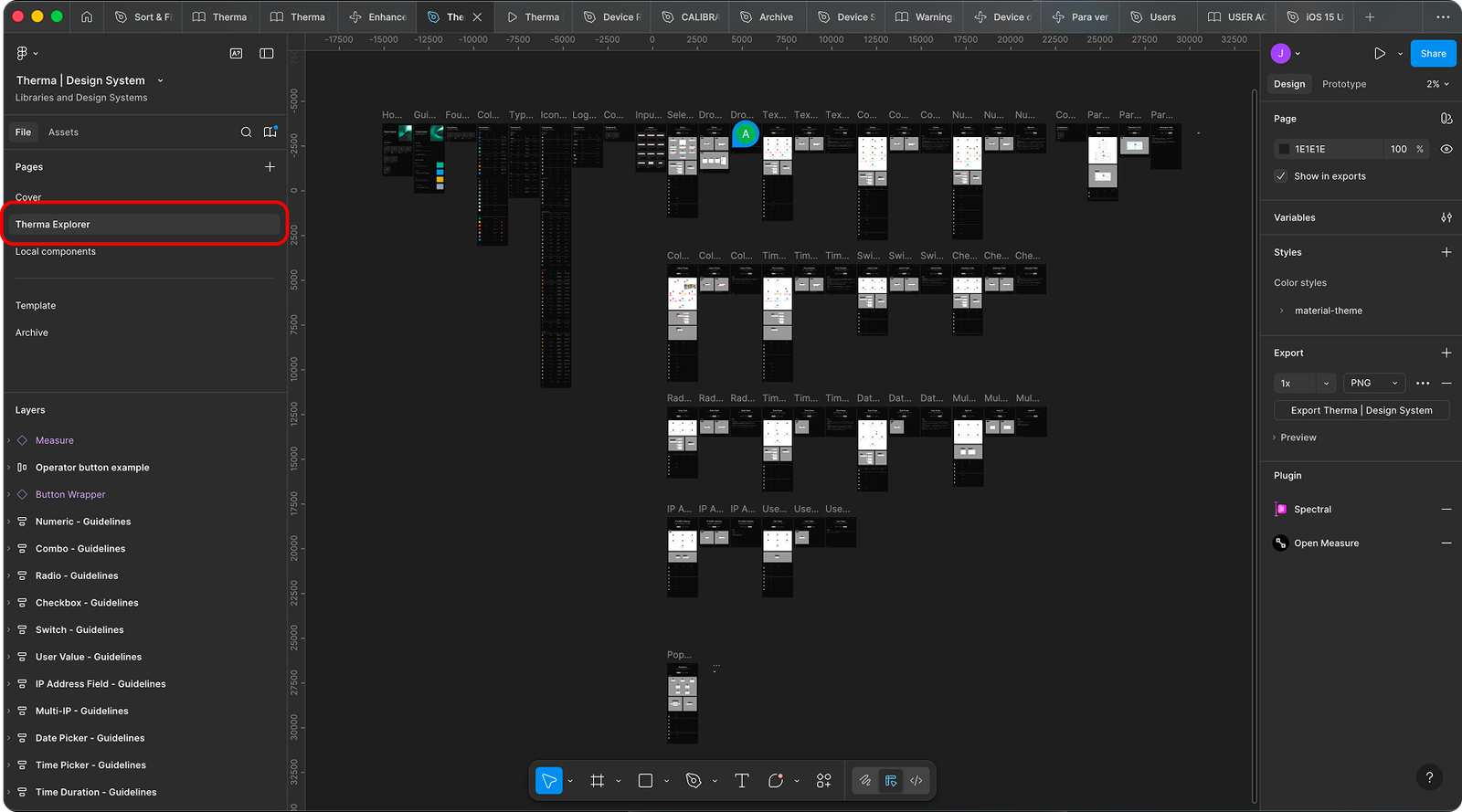
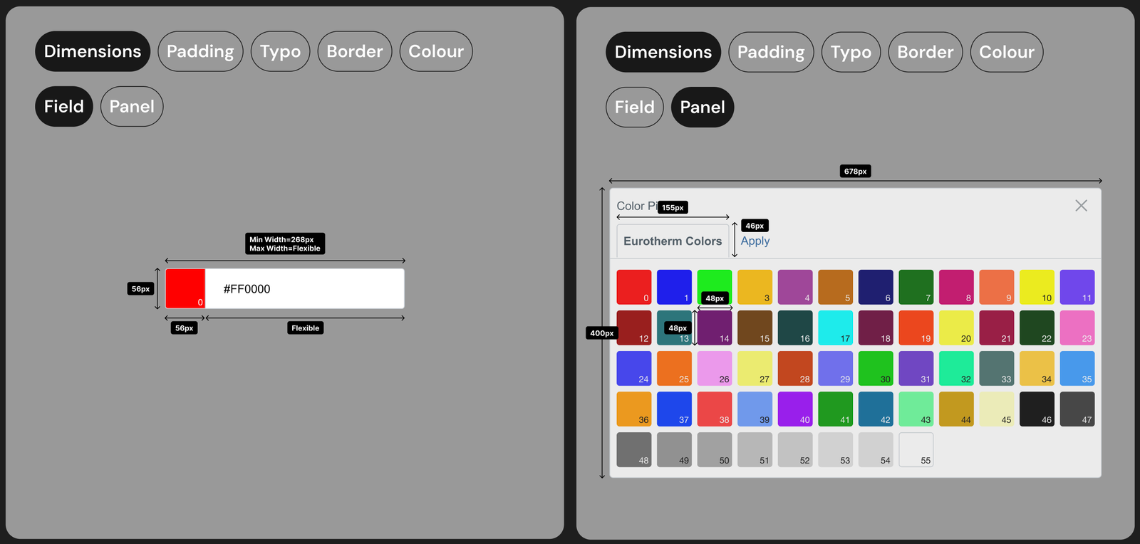
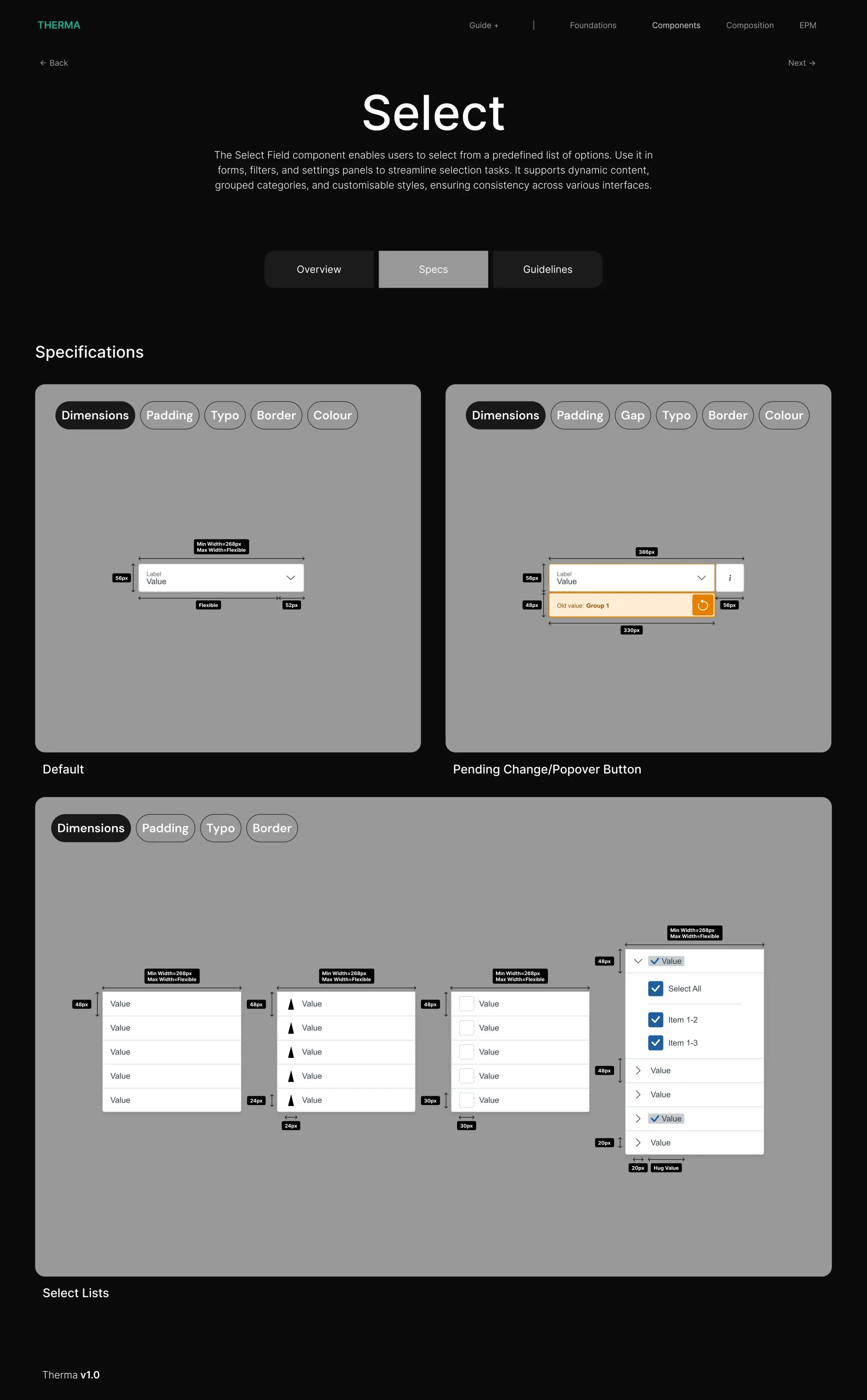
- FoundationsBrand, typography, colour and variables
- ComponentsReusable controls, states and variants
- Product patternsRelated controls organised around tasks
- Shared implementationBootstrap-based UI, frontend rules and onboarding
How I built it
- Defined a software language. I translated the broader brand guidelines into font, colour and interface choices for the products.
- Structured reusable components. I used Atomic Design to organise the system and document how smaller parts formed larger patterns.
- Worked with the implementation already in place. The frontend used Bootstrap, so I kept what was useful and customised the many elements the software needed instead of recreating every primitive.
- Aligned design and code. I worked with frontend developers on common component rules and variables so the Figma library and implemented UI could follow the same decisions.
- Moved the system into Figma. I delegated progressively more of the migration work to a junior designer, who went on to lead the core asset migration. I retained the system direction and supported his growing ownership. Figma gave the team more flexibility to maintain and use the library.
How the system was used
Designers used the Figma foundations and components when creating new screens, with states, variants and measurements documented for specific controls. Frontend developers used shared rules and variables in their Bootstrap-based implementation instead of rebuilding each control independently. I introduced new hires to the library during onboarding so they could follow the same conventions.
How I helped the system scale
The system was already part of everyday design and development in my growing team. By the end of my four years at Watlow, wider adoption was starting across four teams in the UK, US, France and India, within an R&D organisation of approximately 50 developers. I established design reviews so teams could discuss new interface decisions against the shared foundations and get guidance as adoption developed.
- UKBeginning adoption
- USBeginning adoption
- FranceBeginning adoption
- IndiaBeginning adoption
The difficult part
Developers were initially resistant to changing the way they built interfaces. The system became more useful as we worked together on the rules behind components and saw why reuse mattered in real product work. That collaboration developed gradually; it was not solved by handing over a library.
I wanted a shared foundation that saved the team from making the same component decisions again and again.
What changed
The products became more consistent. As the team grew over four years, the design system became part of how people designed and built new screens. Teams in Italy, France and the US also contacted me when starting new products because they wanted to align with the existing system.
Reusing library components meant new screens no longer started from scratch; the impact model above illustrates the potential saving for complex controls such as selects and panels.
Retrospective
I changed direction several times at the beginning before finding an approach that worked for the team. Atomic Design gave the library a structure, while Bootstrap gave engineering a practical starting point. I learned to customise where the product needed it and reuse what already worked. That was more sustainable for my time and for the developers maintaining the interface.