Impact
Less scrolling, validated by beta customers
Customer beta testing showed that the first parameter-grid layout required too much scrolling. Engineers needed quick access to settings, while operators could be wearing gloves or working in conditions where interacting with the screen was difficult.
I redesigned the grid to keep more related settings visible together, balancing information density with clear grouping across screen sizes.
In the second round of customer beta testing, the revised layout was validated as addressing the excessive scrolling identified in the first version.
The starting point
The older Eurotherm interfaces were visually overwhelming. Years of dense controls and information made them slow and difficult to scan. Experienced users knew their way around, but often because they had learned to work through the complexity.
EPM was a new platform. Over four years at Watlow / Eurotherm, I designed its interface from scratch, including configuration, trends and alarm views. The older experience gave us important context about the work users already knew how to do. People had to monitor alarms and trends and change configurations; the challenge was to make that information easier to scan without hiding the density their tasks required.
What I designed
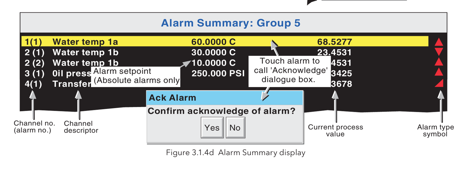
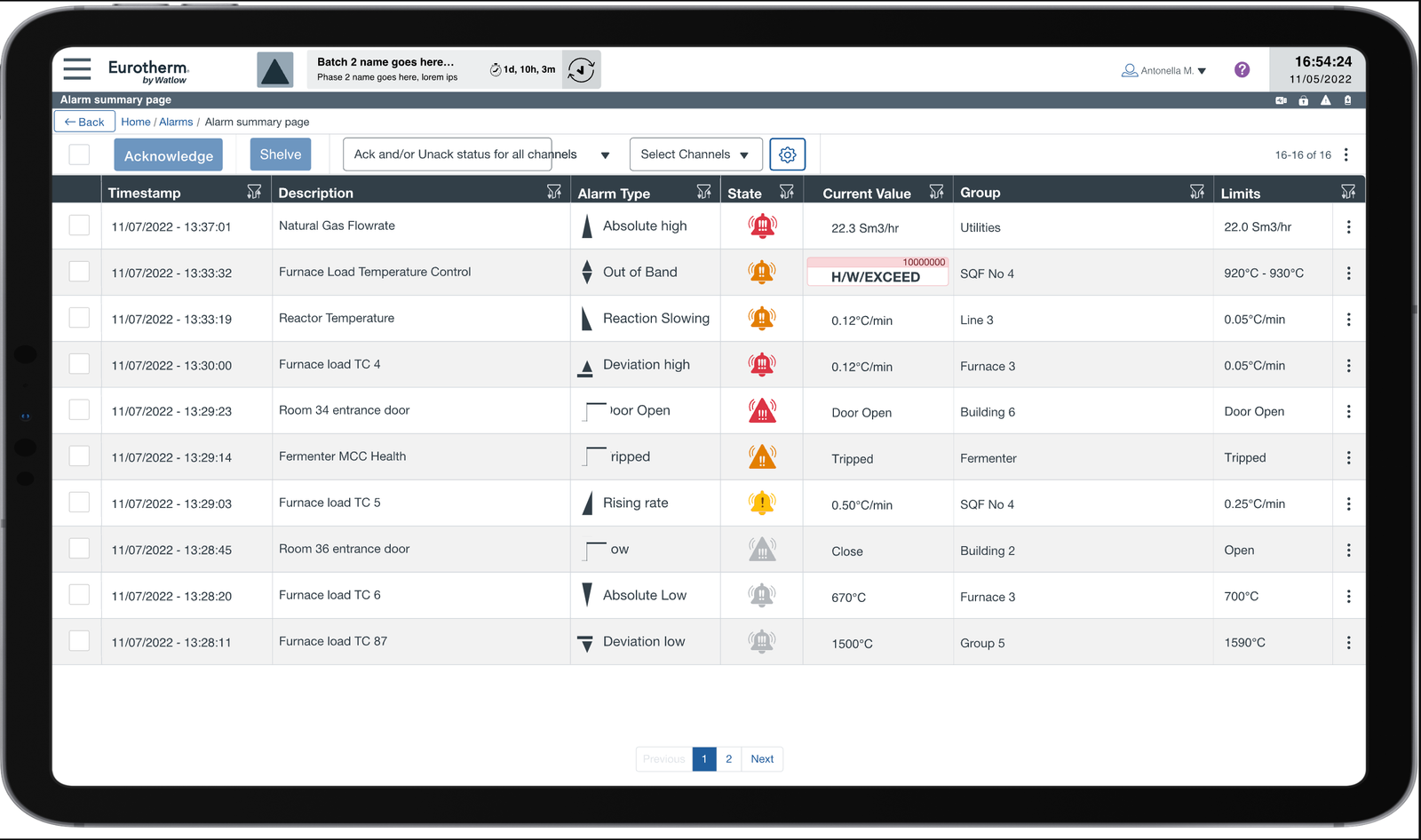
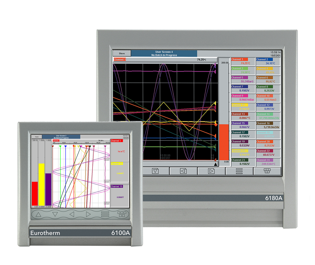
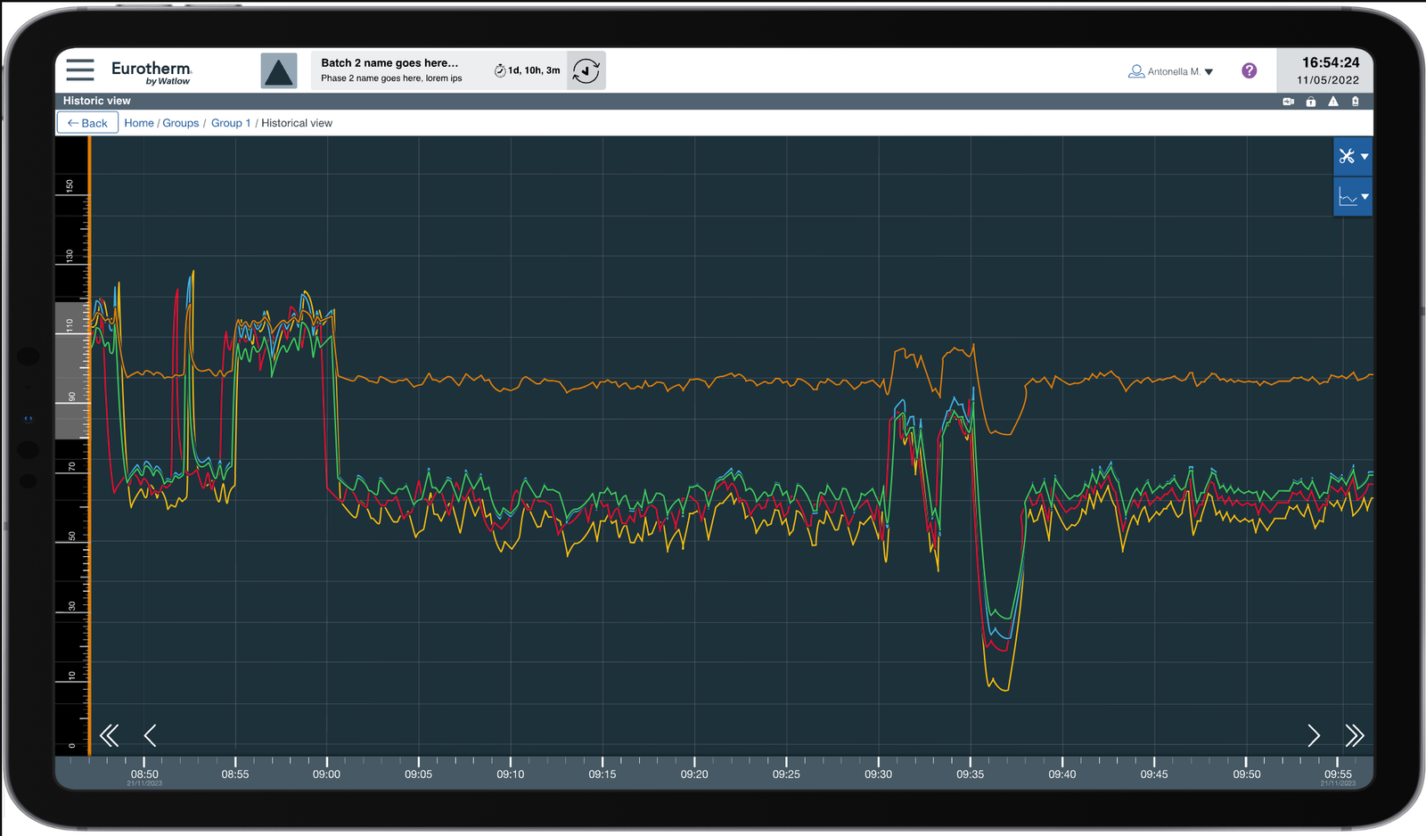
My work covered the EPM interface, from the overall visual and interaction direction to individual workflows. These examples place the legacy alarm summary, recorder trends and configuration alongside screens I designed for EPM.
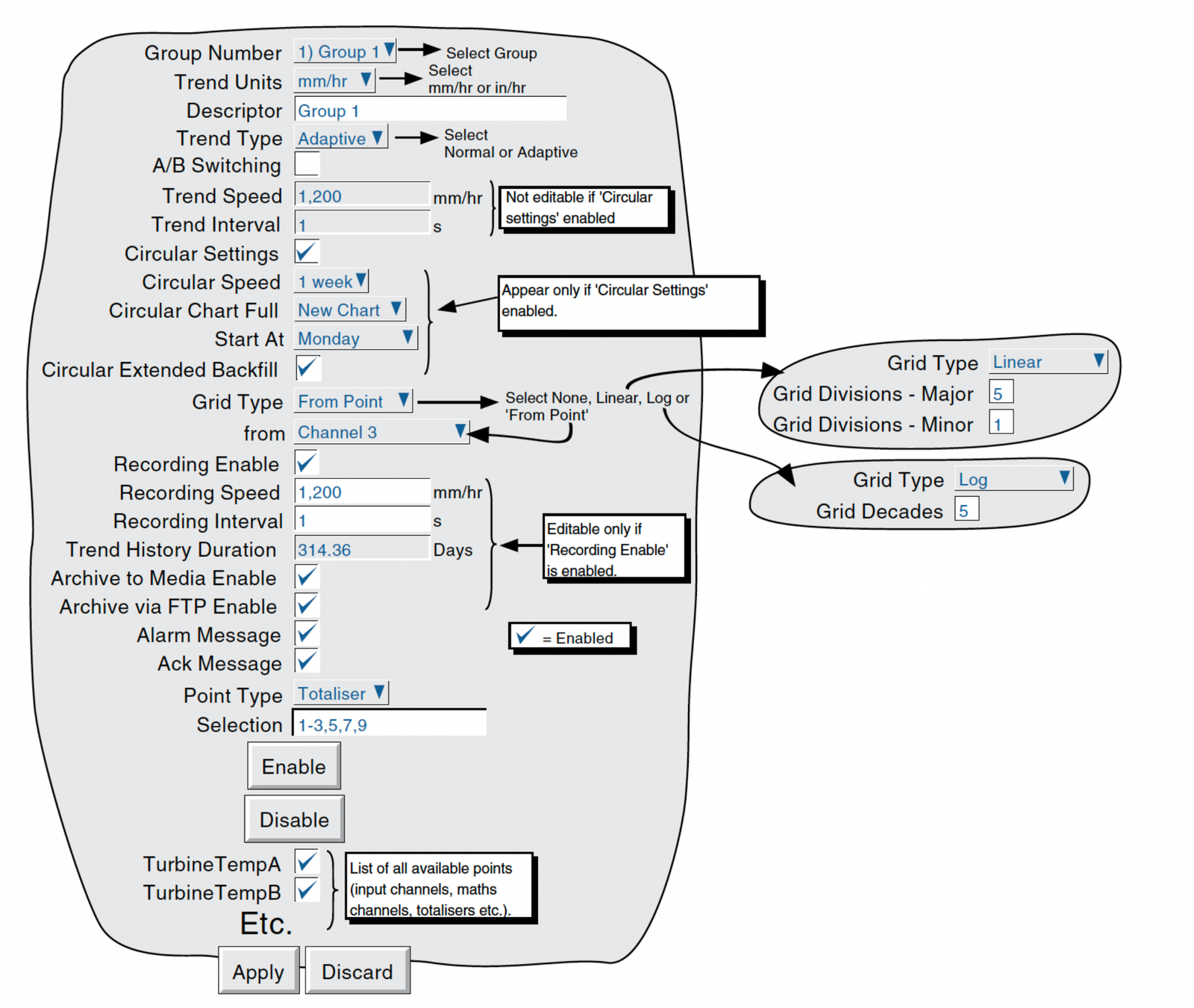
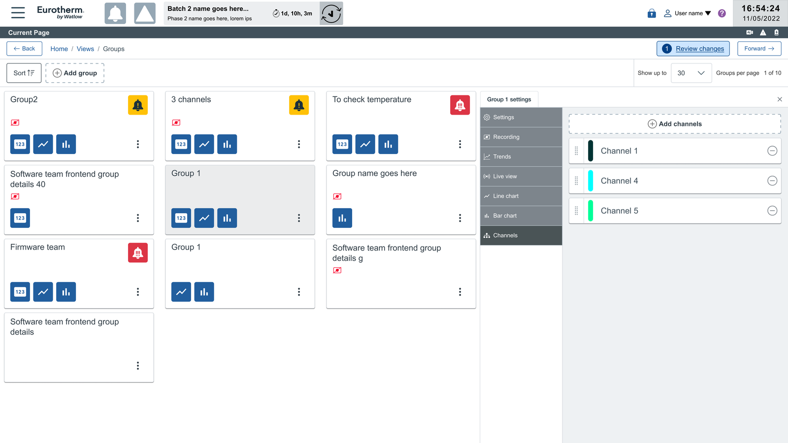
The parameter grid: when my first solution failed
Configuration became one of the most debated parts of EPM. I had spoken with long-standing customers and internal specialists about the older interface. They knew it well after years of use, even though its density made it hard to scan. My brief was to make the new product faster and easier to use, so my first design placed settings in a clean, single column.
Watching customers test that prototype changed my view. They had to scroll much more to complete familiar tasks. Their working conditions mattered too: operators could be in a hurry or wearing gloves, making repeated touch gestures awkward. They wanted to see and compare more controls at once. The stakeholders' answer was to restore a densely packed layout much closer to the old one. I did not think that solved the original problem.
Getting the team to a better compromise
I organised workshops with stakeholders, developers and architects to work through the disagreement. I took the feedback seriously, including the part that challenged my own design, while keeping the need for a clearer interface on the table. I then built a quick responsive HTML prototype: related settings stayed together, but more fields appeared side by side on larger screens. I explored the layout at 15 inches, on the seven-inch display and on mobile, and included keyboard and touch interaction options for operators working in different conditions.
The team accepted that direction. In the next round of customer testing, users responded positively to the revised layout.
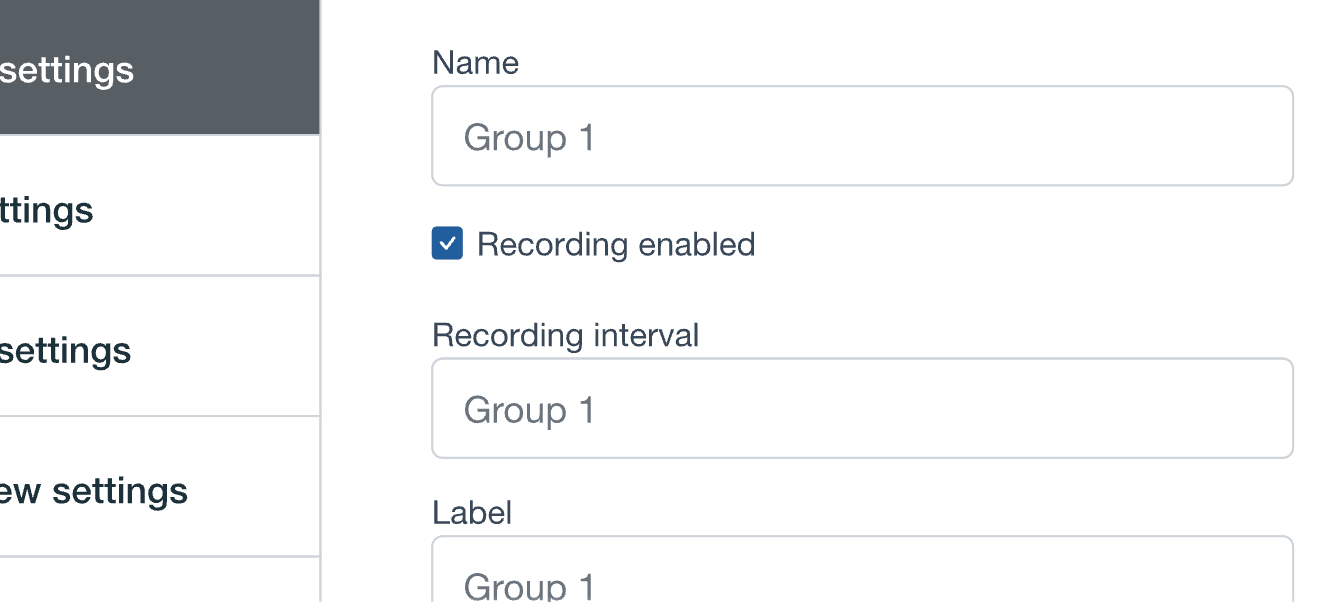
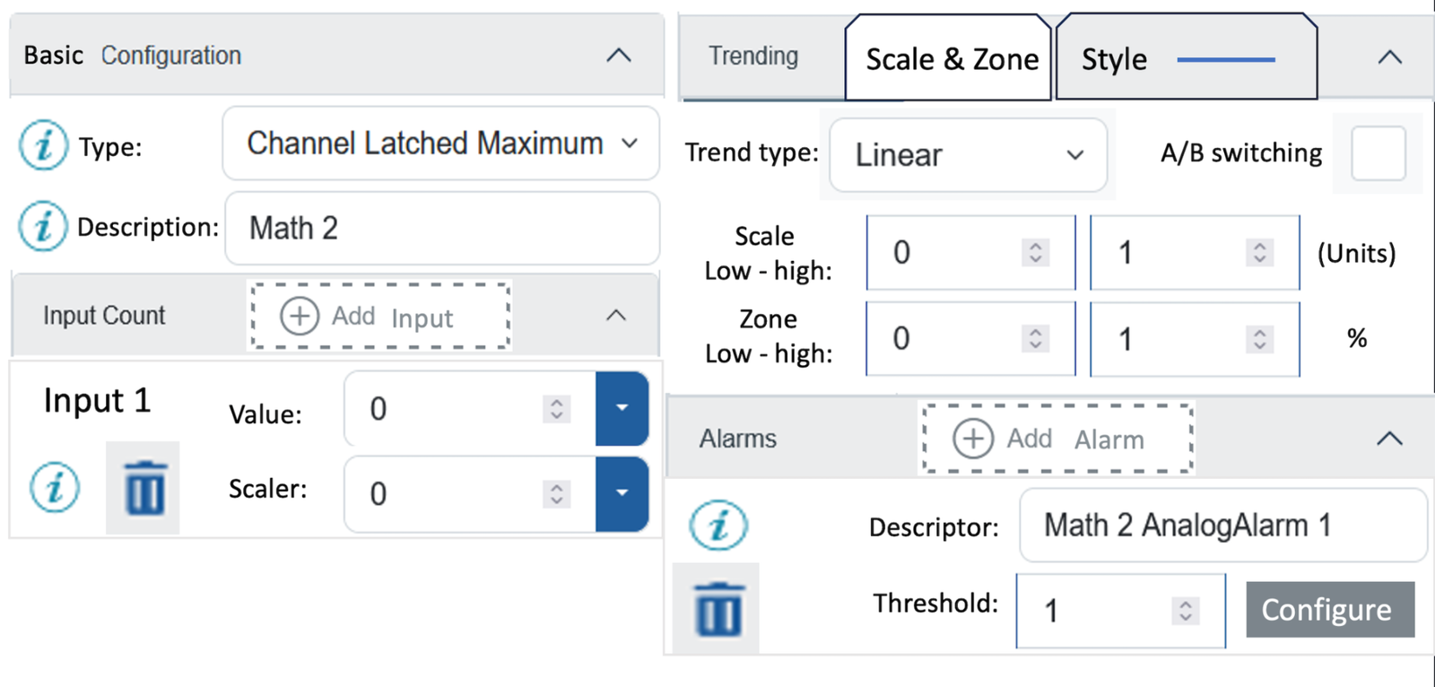
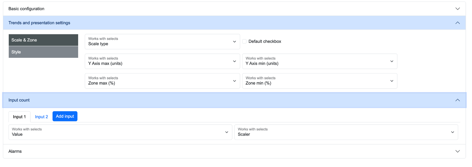
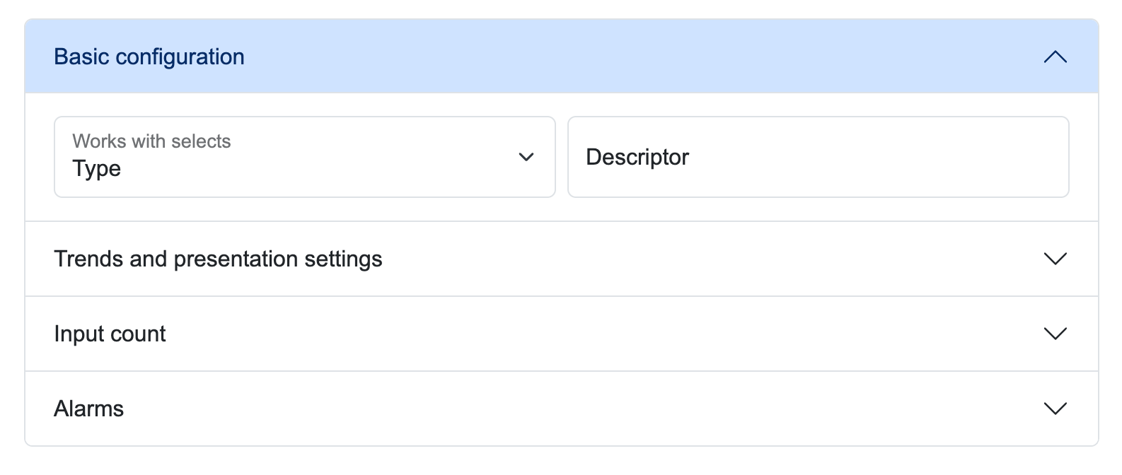
The answer was neither my sparse first version nor a return to the old density. Testing showed us where visibility mattered; the prototype gave the team a way to agree on how to provide it.
Result and stage
The EPM interface reached beta while I was on the team. Customer testing led to less unnecessary scrolling and more controls visible together. The revised layout was accepted by the team and received positive feedback in the second round of customer testing.
Retrospective
I had treated a general preference for simpler screens too literally. I learned to watch the work before deciding what counted as clutter. In this context, useful density, quick access and physical working conditions were part of usability. Bringing a working prototype into the disagreement helped us evaluate an alternative together rather than argue over two static extremes.